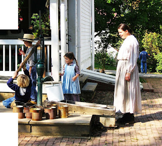
I've been experimenting. I have a number of photographs which I took at Slate Run Historic Farm Metro Park last year, which were really interesting, of kids playing with an old fashioned water pump. I've been wanting to try painting them, but was intimidated by having some many people in the photo.
Below, you may recognize two parts of this photo. I painted the water cans in November
here. And the little girl
here. (Although it was a slightly different view of her looking down at the water pail instead of at the boys.) In this photo, I have actually combined a couple different shots into one in Photoshop, because I liked how the blond boy on the bottom left was hanging on the pump handle. I had a third photo that I wanted to add, of the woman walking in from the left, instead of standing at the right. But after playing around with it, I like this composition best.
My next concern was that I tend to rush into a painting and don't think ahead about the color selections. I've been studying many paintings online to try to understand the use of color in composition - which colors catch the eye, which combination of colors appeal to me and just why the work together. I know academically why they work when I see a piece someone else has painted, but I tend to forget all that when I paint for myself. So this time, I thought I would go at it a different way and SLOW DOWN.
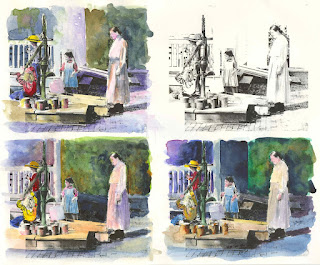
I got a brilliant idea (at least I thought it was - haha). I decided to take the above photo, change it to black and white and make it look like a line drawing. I am lazy, I hate to make study sketches by hand and since I work on a computer most of the day, I thought I'd try this. Within Photoshop, I told it to print multiple photos, 4 at 4x5 inches on one page. I tried to print it out on the laser printer on 140lb watercolor pape, but my printer didn't like the thickness of this, so I ended up printing it on standard card stock. (I bought some 90lb watercolor paper yesterday, and intend on trying that today. Don't try this on ink jet printers, it won't work since the ink is water soluble.)
See photo below (as always, you can click on the photo to enlarge it.).
Yesterday, I played around with colors and composition on the card stock. It actually worked out pretty well as long as I didn't use too much water. You can see an unpainted print in the upper right. As far as the composition in general, I was bothered by the house in the background middle, and wanted that area to be diffused and less noticable, although I liked the porch railings to the left. I like the composition of the bottom left the best with the side of the house removed. I will add some indistinct shapes in the back later.
I wanted to draw most of the attention to the two boys. I was trying different color combinations of red and yellow to draw your eye there first. I think I like best the bottom boy in a red sweatshirt and the standing boy with a yellow hat. There are still lots of things I'd like to try, and will continue to work on these studies until I get the nerve to start the larger piece.
Has anyone used a technique like this to get started with a painting? It reminds me of the old fashioned way of hand painting color into a black and white photograph.

 This is pastels on maroon suede mat board. Process shots above.
 This was just a quick watercolor that I did this evening. Real hard for me to control watercolor paint to do 'hair'.
 Finally I feel like I had some success on Yupo! I used the photo from Karin's challenge. I tried to be more patient and let the paint dry before moving to another area. Since I have a week and a half before the challenge is due, I plan on playing around with some other compositions before I decide which one to send to her.

 Then I started adding the local colors.
 More color. I really like how the kids and the pump look at this point. I changed the navy sweatshirt to red to bring more attention to the kid.
 But had to finish the background and the pump is a bit lost now, but the boys were to be the main focal point of the painting.
 My next concern was that I tend to rush into a painting and don't think ahead about the color selections. I've been studying many paintings online to try to understand the use of color in composition - which colors catch the eye, which combination of colors appeal to me and just why the work together. I know academically why they work when I see a piece someone else has painted, but I tend to forget all that when I paint for myself. So this time, I thought I would go at it a different way and SLOW DOWN.
