 |
| "Pines Path", 8x10", oil on Arches Oil paper |
Wednesday, March 11, 2015
Studio Sunday - Pines Path
I've got a thing for pine trees. They are my favorite tree to paint, if you haven't noticed. This painting was done on Arches Oil paper. It looks just like Arches Watercolor paper but it is made for oil paints. It takes some time to get used to how to paint on it, as I feel you need a good layer of thin paint down before it starts to behave. I feel I had good luck with this one. It came together pretty quickly and so I didn't get any process shots.
Sunday, March 01, 2015
Studio Sunday - Pine Shadows
Another snowy Sunday spent in the studio! Pastel on Ampersand Pastelbord.


 |
| Pine Shadows, 11 x 14, pastel on Ampersand Pastelbord |
Saturday, February 21, 2015
Snow Day in the Studio
Today we got 6-8 inches of snow, so I stayed in all day and finally got back into the studio. I wanted to play around with some square compositions, so I cropped some of my photographs and did some thumbnail sketches.
 I liked the last column the best. The others have possibilities except column number 2 from the left which just didn't work well.
I decided to try using a Richeson pastel board for the first painting. I felt I had to get a fairly thick layer of pastel on the surface before it cooperated. Not sure I'd use that product again. Process shots below:


I decided to try using a Richeson pastel board for the first painting. I felt I had to get a fairly thick layer of pastel on the surface before it cooperated. Not sure I'd use that product again. Process shots below:
I got more fiddly than I wanted - I wanted it to be a bit more graphic and loose. Maybe next time!
Monday, January 26, 2015
More Experiments with Artagain Paper
Because I enjoyed the Artagain black paper, I thought I'd try some of the other colors. I didn't know this paper has been around so long, nor that it could be used for pastels. I prefer to use sanded pastels papers because of my dislike of Canson Mi-Teintes paper. I have to say though, that when I first used the Canson, I was fairly new to pastels. It can be a frustrating paper because you cannot lay many layers. Now that I have spent a lot of time with pastels, I might have to reconsider and try it again since the Artagain is a similar paper except without the "patterns" on one side of the Canson.
After I had cut a variety of the Artagain to size for my custom sketchbook, I thought I would try the scraps to experiment with the soft pastels. I chose a heather-pink color and used the photo contact sheet I still had on my easel for reference. I felt I got too detailed too quickly and forgot to lay down just simple shapes. If you squint the painting might work! ;-)
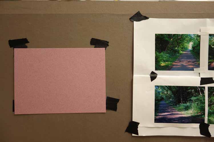
 I used another sheet of the pink to mess around with pastel pencils in the lower view:
 All in all, I think I will use the lighter color papers more for drawings with pastel pencils, graphite, etc., but will do more with the black with soft pastels.
After I had cut a variety of the Artagain to size for my custom sketchbook, I thought I would try the scraps to experiment with the soft pastels. I chose a heather-pink color and used the photo contact sheet I still had on my easel for reference. I felt I got too detailed too quickly and forgot to lay down just simple shapes. If you squint the painting might work! ;-)
Friday, January 23, 2015
Custom Sketchbook
I got a brilliant idea (that is not new) last night. I've been wanting to do more sketching, drawing, etc. especially on trips and to do more architecture which I feel is much easier with pencils/markers, etc.... I have so many sketchbooks and papers and it is hard to decide which to take along. I decided to make my own custom sketchbook with sheets from many of my papers. Where I work, we have one of those spiral binder machines and so I made a new sketchbook and bound it. This is the same size as the watercolor sketchbook that I bought with James Gurney's suggestion, so it will fit on my new wood pochade thingy. That book is a watercolor paper, and I am still not comfortable with that medium for architecture. My custom book is mainly colored papers so when I don't want to do a wet painting, I can grab the new book.
Inside are lots of papers by Strathmore, Canson, and others. Pictures don't describe it much, and it was hard to take photos. I went a bit overboard with the number of papers, but eventually, I can remove pages and put a smaller binding comb on it. The blue sketchbook is the one I bought on Gurney's recommendation. The photo is an odd angle, but both are close to the same size. I put a title page in before each brand so that I would remember what the paper was....


Inside are lots of papers by Strathmore, Canson, and others. Pictures don't describe it much, and it was hard to take photos. I went a bit overboard with the number of papers, but eventually, I can remove pages and put a smaller binding comb on it. The blue sketchbook is the one I bought on Gurney's recommendation. The photo is an odd angle, but both are close to the same size. I put a title page in before each brand so that I would remember what the paper was....
Sunday, January 18, 2015
Studies on Black Paper
I'm a sucker for a product used in a new way. And I enjoy painting pastels on black surfaces, so when Karen Margulis showed on Facebook pastel studies she had done I had to try it since they were also my favorite size and shape at 6x6 inches. She uses Strathmore Artagain Black Artist Tiles which are not made for pastels, but I loved her results.


The goal here is to try to get down to big shapes with little detail and pay attention to values. This process is a great learning tool! It is difficult to STOP at the basic big shapes. The first one I did included the most detail, and as I went on to the next, I really tried to stop. Great fun.
Second:
Third:
Since the paper is very smooth, this process works best with very soft pastel brands such as Terry Ludwigs, Great American, Mount Visions, and Diane Townsends.
These are a bit hard to photograph as the lights stand out a bit strong here.
Sunday, January 11, 2015
Winter Shadows
I've really been noticing the beautiful colors in the shadows of the snow this year. Generally, I see these on my way to work and can't stop and take photos. Saturday morning though, I was up at that hour where the morning sun is pinkish and the shadows in the snow are nicely blue/purple. I quickly took some photos through the windows before the clouds appeared.
Today, it is grey and dull and we are expecting another combination winter storm with sleet, snow, freezing rain, etc... UGH. So I spend the afternoon in the studio painting from yesterday's photo. Love how this one turned out!
 |
| "Winter Shadows", 6x6 on Ampersand Gessobord. |
Sunday, January 04, 2015
Nine Days of Painting
I took some vacation time over the holidays and had 11 days off. After two days, I decided I needed to spend each of the remaining days doing some kind of art, even it is was just a sketch or experiment.

"Rachel" from a couple days ago was the first. Here are all of them. It was difficult to decide on a design each day, and some are really poorly done, but it was a good learning tool.
 |
| Day 1 - Rachel |
 |
| Day 2 - using up the paint on my palette from day 1 |
 |
| Day 3, pastel |
 |
| Day 4 - Conte crayon |
 |
| Day 5 - after two failed attempts at other subject matter, I ended up just applying pastels in a random design. |
 |
| Day 6 - attempted a watercolor in my travel sketchbook, of the Downton Abbey castle. I could not get the watercolor to look right, so had to finish with gouache. |
 |
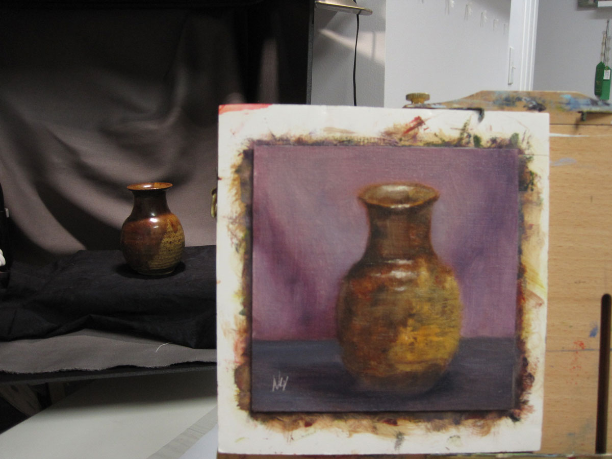
| Day 7 - oil still life with items from thrift store |
 |
| Day 8 - "Daisy" oil applied with painting knife. |
 |
| Day 9 - I really wanted to complete this as a 9x12 oil, but I had to wipe out 3/4 of the painting. I can easily cut this one down to a 6x6 (canvas on gatorboard). |
And here is the whole collection:
Thursday, January 01, 2015
Sketchbook Pochade Upgrade
I had some great suggestions from one of my online friends on how to hold my sketchbook pochade open, instead of using bulldog clips (see: http://nartizt.blogspot.com/2014/11/busy-busy.html). I had time today to upgrade the pochade by using offset clips:
 I bent them a tiny bit, so that the upright working surface would be greater than 90 degrees from the palette area.
 Then I needed something to hold it from flopping shut in the wind. I took another offset clip and mounted it with a wingnut and knurled nut. This is a view with the top closed. The height is perfect and the lid barely touches it.

 Below is a view of the clip in position:
 A slight twist turns the clip so that the lid can be closed:
 Thanks for the ideas, Julie!!
Wednesday, December 31, 2014
On to 2015
I was looking way back on my blog for some photos and I happened to land on this post from the end of 2006. I'm not much of a poem reader, but always liked this one:
New Year Resolve by May Sarton
New Year Resolve by May Sarton
The time has come
To stop allowing the clutter
To clutter my mind
Like dirty snow,
Shove it off and find
Clear time, clear water.
Time for a change,
Let silence in like a cat
Who has sat at my door
Neither wild nor strange
Hoping for food from my store
And shivering on the mat.
Let silence in.
She will rarely mew,
She will sleep on my bed
And all I have ever been
Either false or true
Will live again in my head.
For it is now or not
As old age silts the stream,
To shove away the clutter,
To untie every knot,
To take the time to dream,
To come back to still water.
Sunday, December 28, 2014
There's a New Girl in Town
After I painted the Mr. Potato Head (PH) playing chess in the painting "Checkmate", I was challenged by my friend Wendy to do a number of PHs in different scenes. I purchased a Mrs. PH and plan on using both in a new painting. I was having trouble deciding on a composition, so thought I would just get a feel for Mrs. by painting her portrait first! I Googled and found that she is called Rachel. I could not find a first name for Mr. though.


 |
| "Rachel's Debut", 6x8", oil on OP linen |
Subscribe to:
Posts (Atom)