Saturday, March 28, 2009

Learning Curves

I had lots of new things to learn today. I recently purchased a Guerrilla Painter Cigar Box plein air set. Next week is the first outing of my plein air group and I wanted to get it setup this weekend to get used to it. Today's setup was using the pastel trays.


I needed to make a 'to-go' set of pastels, so broke my pastels into smaller pieces (GASP!!!) so that more would fit. I guess most pastel artists regularly break new sticks into smaller sizes, but man, was it hard for me to do this, especially with my Unison handmade pastels! Here's the final set, and the box also shows the different size panel brackets for 8x10, 5x7, and 4x6 panels in the lid.

Another new issue for me was learning to paint in a vertical fashion, on an easel. In the beginning, it bothered my posture but once I figured out the right working height, it eased up. I really prefer to work flat on a table, but I assume working on an easel would give you a less distorted view of your work. It should also be much easier working in plein air so that the view will be in the same visual plane as the easel.

Today, I was using a 10x8 Sennelier La Carte Pastel card. This was another learning curve. I love using suede matboard, but decided to try this today. The color is actually a bit bluer than the photo shows below. To the right is the crop I chose to use of Karin's photo.
Left - first color. Right - midway into painting.
Final painting below.
I wanted to get more vibrant color in her bikini, but didn't seem to have a bright enough pastel.
Boogie Beach Board
10"x 8"
Soft Pastels

See the other entries on Karin's DSDF site.

Friday, March 20, 2009

Drawings

Last night was our monthly Worthington Art League meeting. We had a lovely model posing for us. These were short, 10 minute sketches. I always forget how much fun it is to just draw.... I finally got around to using my travel sketchbooks for this work.

I was afraid to draw her perky nose as it really was, for some reason....


Posted by Picasa

Saturday, March 14, 2009

Pastel - Sushi

'California Roll' - 6" x 8" - Pastel on Suede Matboard

Here's my entry in Karin's current challenge on DSDF. This was pretty fun! I love how it turned out.

Friday, March 06, 2009

Watercolor - Boy with Donkey

I like parts of this, but the composition doesn't work. The background in the photo was so busy and I started out just blocking in shapes, but it got so confusing that I scrubbed them out and just blurred it. The guy behind the donkey - his hat showed up above the ears of the donkey, but when I put it in, it looked like the donkey was wearing a hat! So scrubbed that out too. Frustrated....

Saturday, February 28, 2009

Wig Woman 4


This is pastels on maroon suede mat board. Process shots above.

Ok, I am tired of painting wigged women! Still deciding on which one to send to Karin.

Thursday, February 26, 2009

Wig Woman 3

This was just a quick watercolor that I did this evening. Real hard for me to control watercolor paint to do 'hair'.

Still planning on trying a pastel before I submit my entry to Karin.

Sunday, February 22, 2009

Wig Woman 2


This is attempt #2 using Karin's photo for the challenge. This is watercolor on Arches 140# cold press. I really like this one.

I plan on trying one more in pastel before the deadline, but I am off to cut mats and frame some previous works. There are several local shows this spring that I plan to enter and I need to decide which pieces might be the best to enter.

Saturday, February 21, 2009

Conquered!

Finally I feel like I had some success on Yupo! I used the photo from Karin's challenge. I tried to be more patient and let the paint dry before moving to another area. Since I have a week and a half before the challenge is due, I plan on playing around with some other compositions before I decide which one to send to her.

Sunday, February 15, 2009

Boys at the Pump


I changed my mind and decided to paint a different closeup view from my last posting's composition.

I decided to try Judy Treman's technique from "Building Brilliant Watercolors" for using a purple for an underpainting. I've always been a big fan of monochromatic painting, so its hard to move on to real color.

Then I started adding the local colors.

More color. I really like how the kids and the pump look at this point. I changed the navy sweatshirt to red to bring more attention to the kid.
But had to finish the background and the pump is a bit lost now, but the boys were to be the main focal point of the painting.

Monday, February 09, 2009

New Idea?

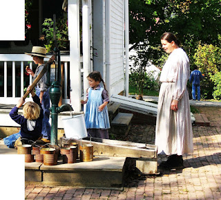
I've been experimenting. I have a number of photographs which I took at Slate Run Historic Farm Metro Park last year, which were really interesting, of kids playing with an old fashioned water pump. I've been wanting to try painting them, but was intimidated by having some many people in the photo.

Below, you may recognize two parts of this photo. I painted the water cans in November here. And the little girl here. (Although it was a slightly different view of her looking down at the water pail instead of at the boys.) In this photo, I have actually combined a couple different shots into one in Photoshop, because I liked how the blond boy on the bottom left was hanging on the pump handle. I had a third photo that I wanted to add, of the woman walking in from the left, instead of standing at the right. But after playing around with it, I like this composition best.

My next concern was that I tend to rush into a painting and don't think ahead about the color selections. I've been studying many paintings online to try to understand the use of color in composition - which colors catch the eye, which combination of colors appeal to me and just why the work together. I know academically why they work when I see a piece someone else has painted, but I tend to forget all that when I paint for myself. So this time, I thought I would go at it a different way and SLOW DOWN.

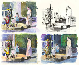
I got a brilliant idea (at least I thought it was - haha). I decided to take the above photo, change it to black and white and make it look like a line drawing. I am lazy, I hate to make study sketches by hand and since I work on a computer most of the day, I thought I'd try this. Within Photoshop, I told it to print multiple photos, 4 at 4x5 inches on one page. I tried to print it out on the laser printer on 140lb watercolor pape, but my printer didn't like the thickness of this, so I ended up printing it on standard card stock. (I bought some 90lb watercolor paper yesterday, and intend on trying that today. Don't try this on ink jet printers, it won't work since the ink is water soluble.)

See photo below (as always, you can click on the photo to enlarge it.).

Yesterday, I played around with colors and composition on the card stock. It actually worked out pretty well as long as I didn't use too much water. You can see an unpainted print in the upper right. As far as the composition in general, I was bothered by the house in the background middle, and wanted that area to be diffused and less noticable, although I liked the porch railings to the left. I like the composition of the bottom left the best with the side of the house removed. I will add some indistinct shapes in the back later.

I wanted to draw most of the attention to the two boys. I was trying different color combinations of red and yellow to draw your eye there first. I think I like best the bottom boy in a red sweatshirt and the standing boy with a yellow hat. There are still lots of things I'd like to try, and will continue to work on these studies until I get the nerve to start the larger piece.

Has anyone used a technique like this to get started with a painting? It reminds me of the old fashioned way of hand painting color into a black and white photograph.

Monday, February 02, 2009

Finger Paints


I tried all weekend to complete a painting on Yupo. The good thing about this material is, if you hate it, all you have to do is wipe it back off! Let's just say, I wiped off everything I applied. It was very frustrating. I even looked at several demos online showing how to work with it, but it just felt like playing in finger paints on wax paper..... So I give up.

I did sketch a new watercolor on Arches cold press and hope to start that one soon.

Tuesday, January 27, 2009

Different Strokes Painting - Victorian

I'm not a fan of painting architecture. There is something about the precise lines and fussy details that I can't seem to master with a paint brush. But to keep up with my watercolor skills I gave it a shot.

First, I tried using some Fredrix Watercolor Canvas which I had in my stash. Bad idea, it was no fun and very frustrating. So I brought out my favorite Arches Aquarelle 140# cold press block. Much better but it still didn't help with my aversion to painting lines... so I used watercolor pencils to add some details.

Sunday, January 25, 2009

Pastel - Lake Erie Marsh

Experimenting. This is a photo from my friend Cindy who took it near Lake Erie. I had attempted to use Pastelbord in the past, and wasn't too happy with it, but thought I'd give it another shot. Below is the progression of my work. First is the photo, followed by the first strokes of harder pastel on the Pastelbord over top of a previous work that was going to be peaches on a plate.

Next, covering the surface with blocks of color.

Then, I thought I'd try using an alcohol wash as I've seen done by others. I was surprised how much it took away, but liked how it embedded the pigment into the board.
First pass with softer pastels.
Continuing with soft pastels.
Final painting. I wasn't able to add as much detail as I had wanted, because the pastel seemed to lay on the surface as the board was full. But looking at it online, it looks pretty good.
Lake Erie Marsh, 8" x 10"

Sunday, January 11, 2009

Different Stroke Painting of the Week - Jefferson Memorial

Here's my pastel of Karin's photo of the Jefferson Memorial at night. Process shots shown below. I started out with maroon sueded mat board.

Karin didn't post my image and had a note on her page she was having an issue with some photos she was receiving.... so below is a scanned image instead of a photo (above), which I will send on to her. Amazing what difference from one monitor to another it makes.

Sunday, December 28, 2008

Portrait #5 - Pastel on Sueded Mat Board

I've decided this is the one I will submit to Karin's challenge. Although it really doesn't look like the gal in the photo, this one really appeals to me because it LOOKS like a painting. The first one in the posting "Portrait #1" more closely resembles the model, but it looks more like a PHOTO to me.

This one is about 10" x 12" on white sueded mat board (although the first two photos show it cream). I really like this one. I can't decide if I like this one full size or cropped as in the last photo.

I would really like your input as to which of the 5 different portraits (from the last several posts) you like the best and why? Thanks!


Portrait #4 - 15 Minute Exercise

Here is a quick 15 minute pastel done on my favorite surface - sueded mat board - like working on 'budda'... I like this alot, although it really doesn't look like the model. This is about 4" x 7". This was a warm up exercise to the next entry which turned out pretty good too.

Saturday, December 27, 2008

Portrait #3 - Watercolor on Cold Press

Well, here is my attempt at my normal watercolor paper. First, it looked like she had 'helmet head'. It's hard to paint someone with their hair pulled back. Then it turned into mud. In the last photo, I tried to just get wild with the paint, and when it was wet, it was more vibrant. Not a good painting, but I feel every painting session is a learning experience.

Tomorrow I will do one more, in pastel on my favorite sueded mat board, and then make a final decision on which one to submit.